In our last week’s post we discussed the vital role of thumbnails in attracting viewers. This week we bring together tips and tricks from visualizers’ perspective to help create perfect thumbnails that can allure users, while maintaining their dimension and size limits.
Ashu Patodia, one of the top visualizers at 123Greetings Studio shares her thoughts on the aesthetics of the thumbnails. She says, “Creating an effective thumbnail for our ecards can be challenging sometimes, but not impossible provided we keep key pointers in mind.” She also provides a great example from one of her top performing Love ecards to help fellow visualizers get a clear understanding.

Ashu says, “The most important point to keep in mind is the quality & visual content of the thumbnail. This should not be compromised. If you consider thumb 1 of my Love ecard under discussion, the first thing you will notice is that the thumbnail is the exact reflection of the ecard. The primary function of a thumbnail image is to give a visual preview of our ecard. If your thumbnail shows something that is not part of the ecard, it may lead to loss of faith that your followers have in you. To elaborate, see thumb 2 from another romantic ecard.
Thumb 2 has a similar ambience, color theme, roses as basic elements used in the ecard, but it is still not the true reflection of it. Hence, this cannot be used. Also, if we talk on the quality front we need to see that while creating our thumbnails, keeping the 8kb file size is intact, and we do not have a pixelated thumbnail which may look nasty and unclear because of the grainy elements. It’s advisable to keep thumbnails crisp, clear and precise; such that they should be able to grab the user’s interest in that one easy glimpse.”
Here is a thumbnail checklist provided by Ashu:
1. Visuals same as ecard (similar is not justifiable). Highlighting the subject is advisable.
2. Crisp background, images.
3. Clearly legible text (if any) on the thumbnail with the right placement. Overlapping text on the subject of the image/background causing obstructed viewer experience can take away the visual appeal of the thumbnail.
4. Smooth & clean animation (in case of Gif thumbnails).
Inspired by Ashu and Simpydesigns’ work, Jothi, a versatile Studio visualizer, started creating Gif thumbnails. “Gif animated images attract the viewers more as it reflects the theme of the card in a miniature form and the gif image conveys the message directly to the viewer”, says Jothi. She further goes on to explain an easy way to create a gif image. “Take snapshots of the relevant images of the card and place it adjacently in the timeline and export them in animated Gif sequence. The size of the images should be of dimension 115 by 115 pixels. You have to modify the document size also to 115 by 115 pixels.
Here is an example of creating a thumbnail in gif format:
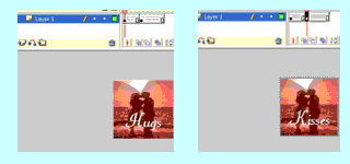 Create a new file with dimension 115 by 115 pixels. In the first frame paste the snapshot of the image. Put the relevant text. Create a key frame on the 5th or 10th frame. Here change the image or change the text. Now insert a frame in the 10th or 20th frame. When the movie is run, it will display the output in gif animation with changing words “hugs & kisses”. This will attract the viewers as it conveys his/ her love in a direct way!”
Below tips will help maintain the file size of the thumb:
• Minimize the use of colors.
• Keep the animation in two frames.
• Optimize the thumb using the optimization tool available on Photoshop and ImageReady.
• Avoid using layers in thumbs, use static screenshots instead.
• Limit the filters.
With some great insights from our visualizers and some technical tips we hope that creating thumbnails will not be as daunting anymore! So thumb away!